
Classic Call-to-Action Adverts
Zubbit has three incredible Branded Text-based Call-to-Action Adverts to choose from to apply to the links you share.
We’ve got our Classic Call-to-Action, our Chat Call-to-Action, and also our Ribbon Call-to-Action. All three give you complete control over the content and look and feel of each Call-to-Action.
Here’s what you can set:
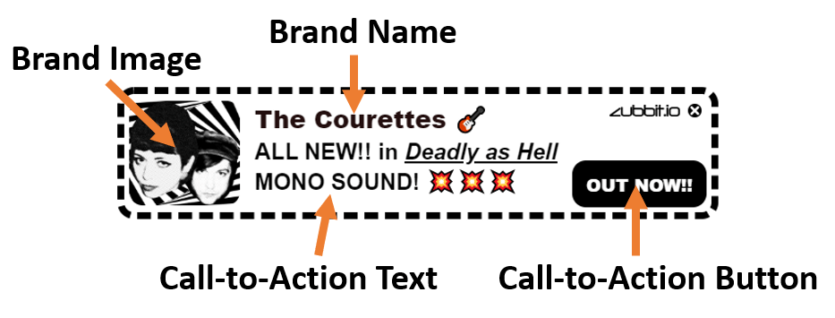
- Brand Image – You can apply any Brand Image you want to your call-to-action and also use animated GIFs if you want.
- Brand Name – On the top of your Call-To-Action you can add a brand, product, or service name.
- Call-To-Action Text – Next you can add some Call-To-Action text, and using our powerful styling options you can make these look really cool.
- Button – Lastly you’ve got a button with whatever text you wish on which when pressed will go to the website/page you’ve set up.

Classic Text Call-to-Action Example
In the Classic Call-to-Action, the brand image sits within the call-to-actions frame. Using the Themes Engine you can set all the visual stylings you are seeing in this example, including the border style and width, the various text elements, styles, colors, weights. Plus you can set your own CSS styles and add emojis to make them look really fun.
Click HERE to see this example in action
Chat Text Call-to-Action Example
In the Chat Call-to-Action, we put the brand image into its own box to the left in a chat-style.
Click HERE to see this example in action
Ribbon Text Call-to-Action Example
The final example is full width across the whole screen. You can have a lot of fun with this one!!


